Working at Humana was my first ever experience as a UX Designer in an enterprise setup. It was during this period
that I gained invaluable experience collaborating with cross-functional teams. Working closely with a UX
researcher, content writer, product manager, and developers in an agile setting, I learned the significance of
aligning with all team members at every step of the design process.
Between 2018 and 2021, I worked on several projects at Humana. However, this project held particular significance
for me. I led the design of this application from the ground up — I was there right from the project's inception,
making it an exceptional and memorable experience in my career journey.
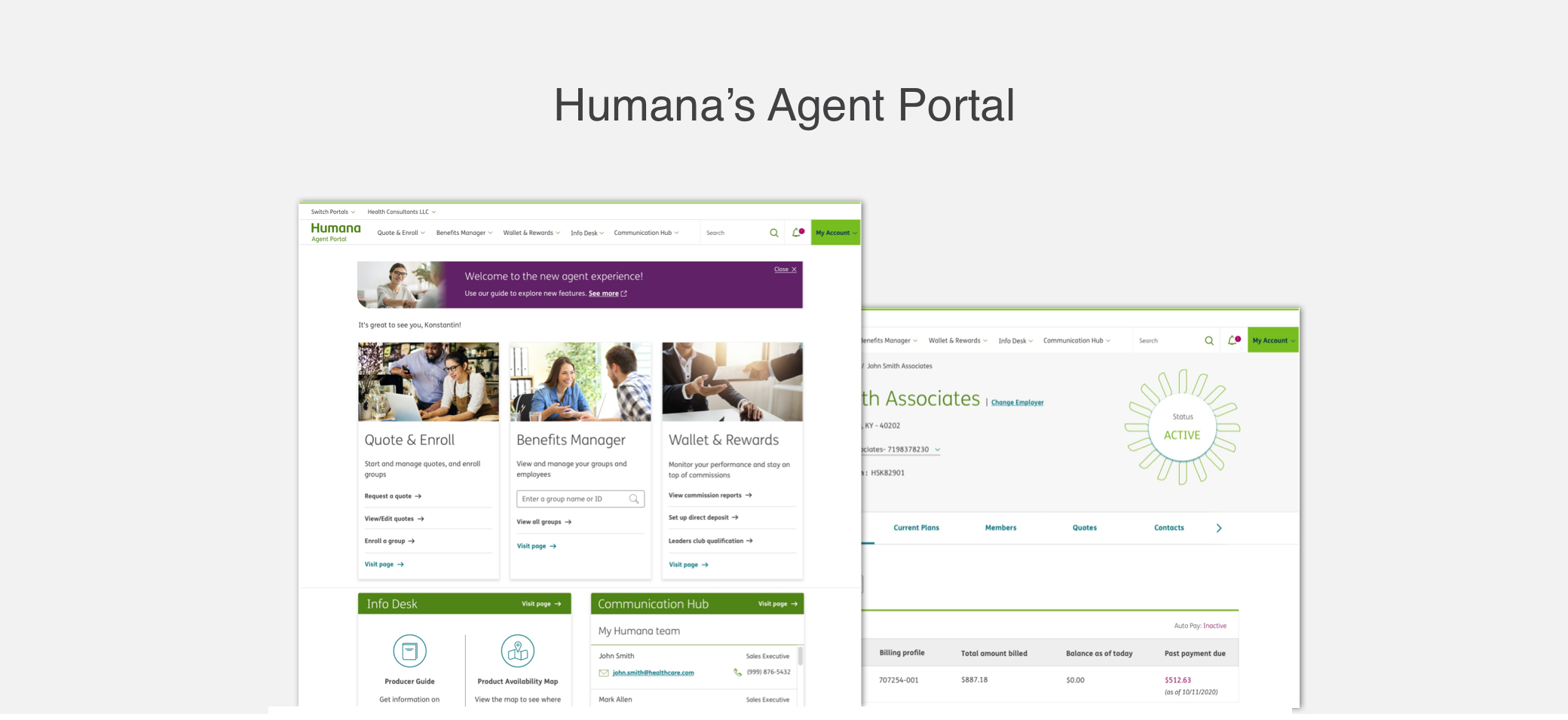
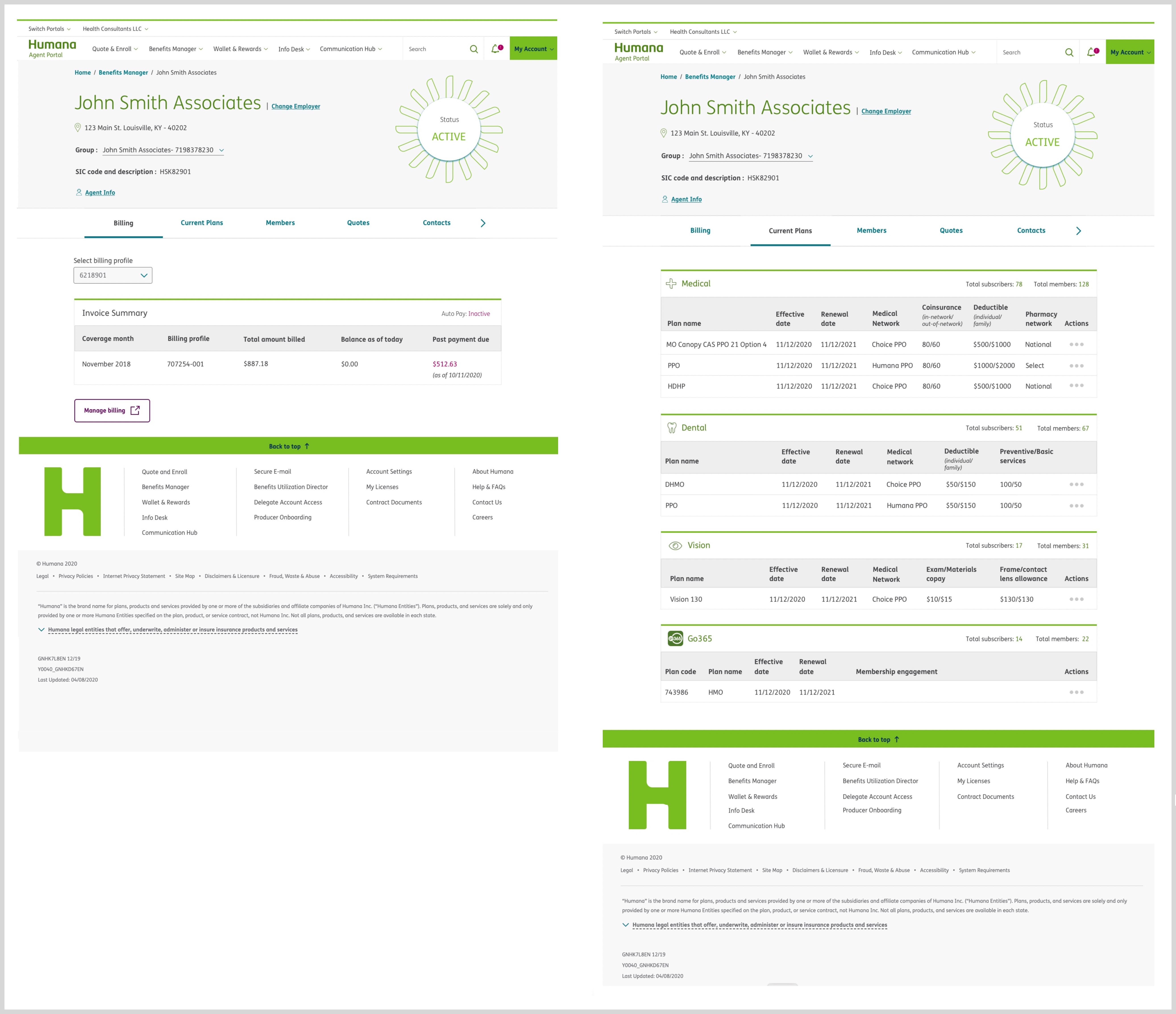
Agent Portal is an interactive dashboard for Humana's insurance agents, designed to streamline their daily tasks
and provide access to tools and resources to help drive sales and manage the business.
Challenges and Goals
- Identify the most important tasks performed by the agents daily
- Identify user's pain points in completing these tasks
- Design a solution that enables them to complete these tasks efficiently
- Implement Humana's new design system in the application
- Measure the outcome and user satisfaction of the new solution
Research
To understand the key tasks of an agent and identify their pain points, I collaborated with the UX researcher on
our team and conducted field interviews and surveys with 20 agents. The takeaways were:
Agent's Key Tasks
- Manage policies, quotes, enrollment, and payments of individual customers and employer/employee customers
- Create quotes for new and existing customers
- Present marketing materials of Humana's insurance plans and offers to potential and existing customers
- Contact the Humana sales team for customer help and support
Identifying Pain Points
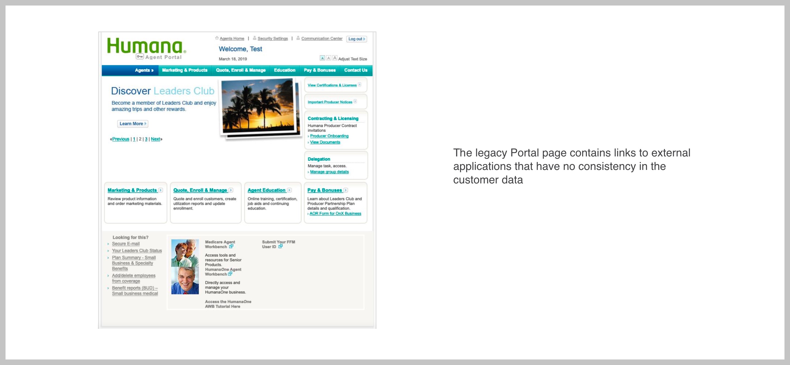
Problem 1: Links to external applications
Humana's lack of a single system of records causes transparency concerns for agents/brokers and requires the
sales team to use manual logs of customer information.
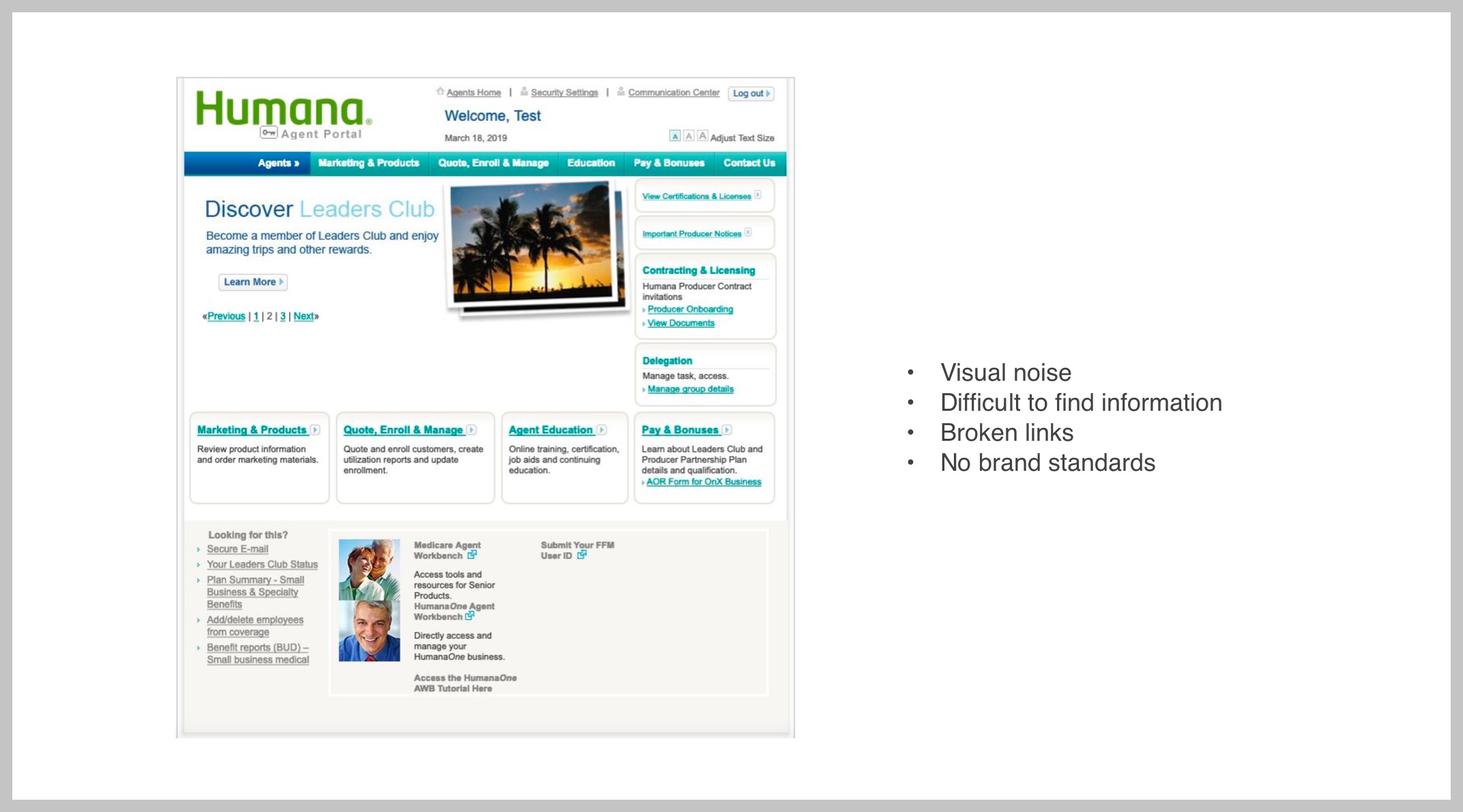
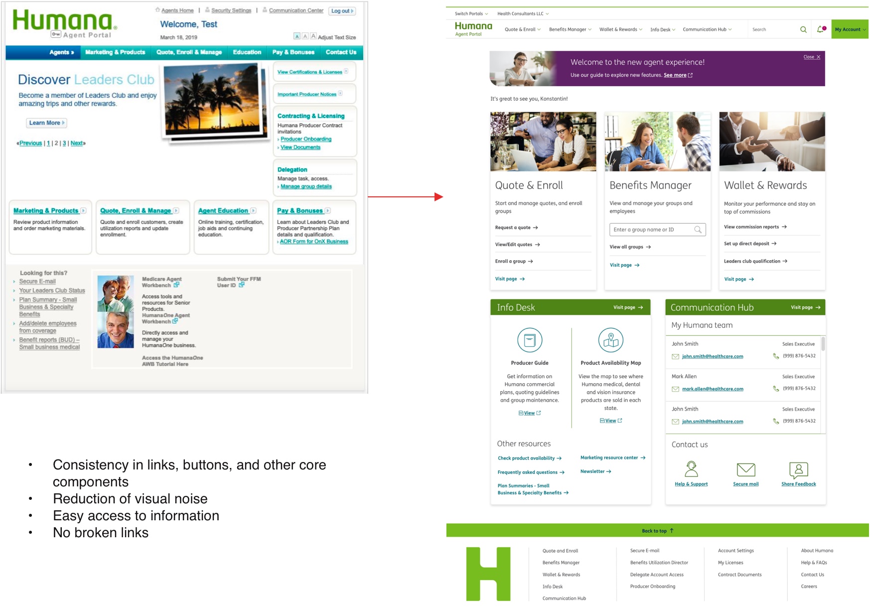
 Problem 2: Inconsistent and Outdated UI
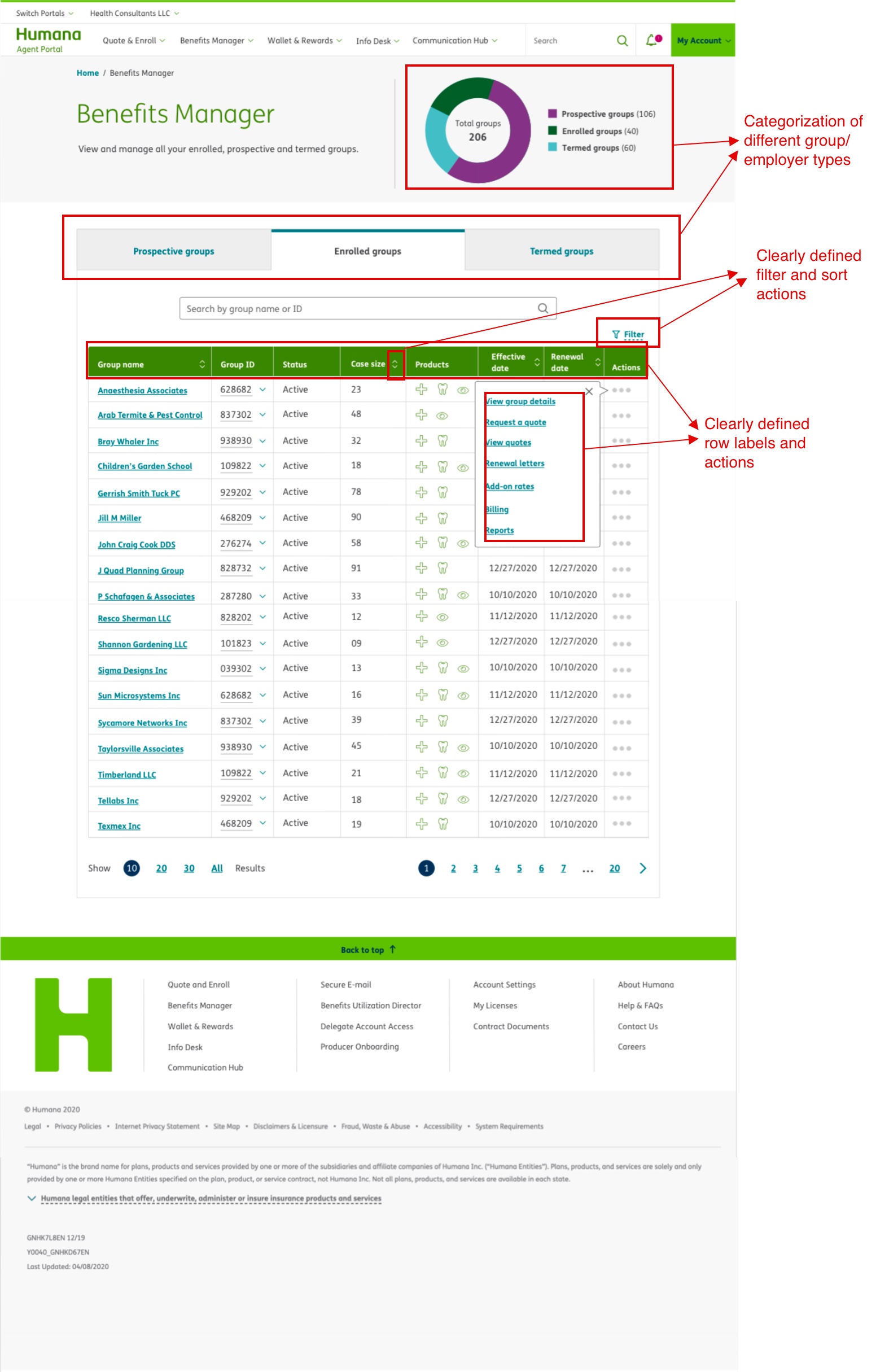
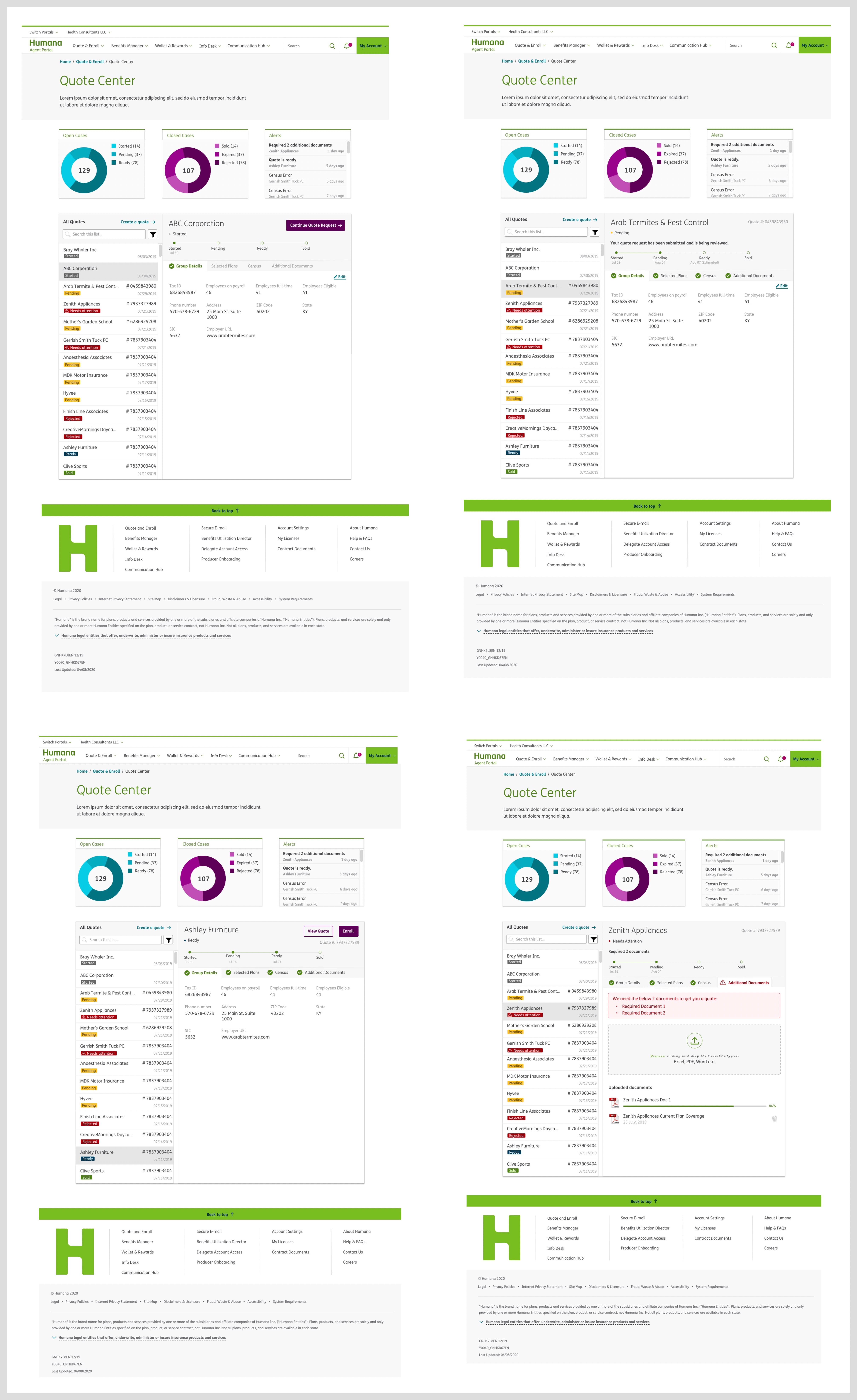
 Problem 3: Customer Listing page
We found that the Customer Listing page had usability issues resulting in poor communication of information.
 Problem 4: No seamless transition between portals with clear and prominent links without additional login requests.
Designing Solutions
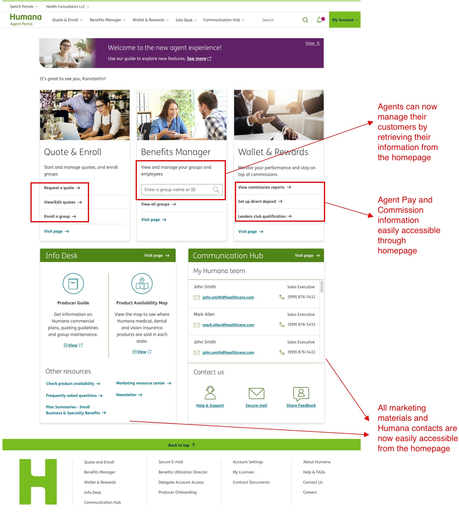
Solution 1: Build a one-stop application for Agents which enables them to perform all their major tasks on one
platform, improving task efficiency and data consistency.
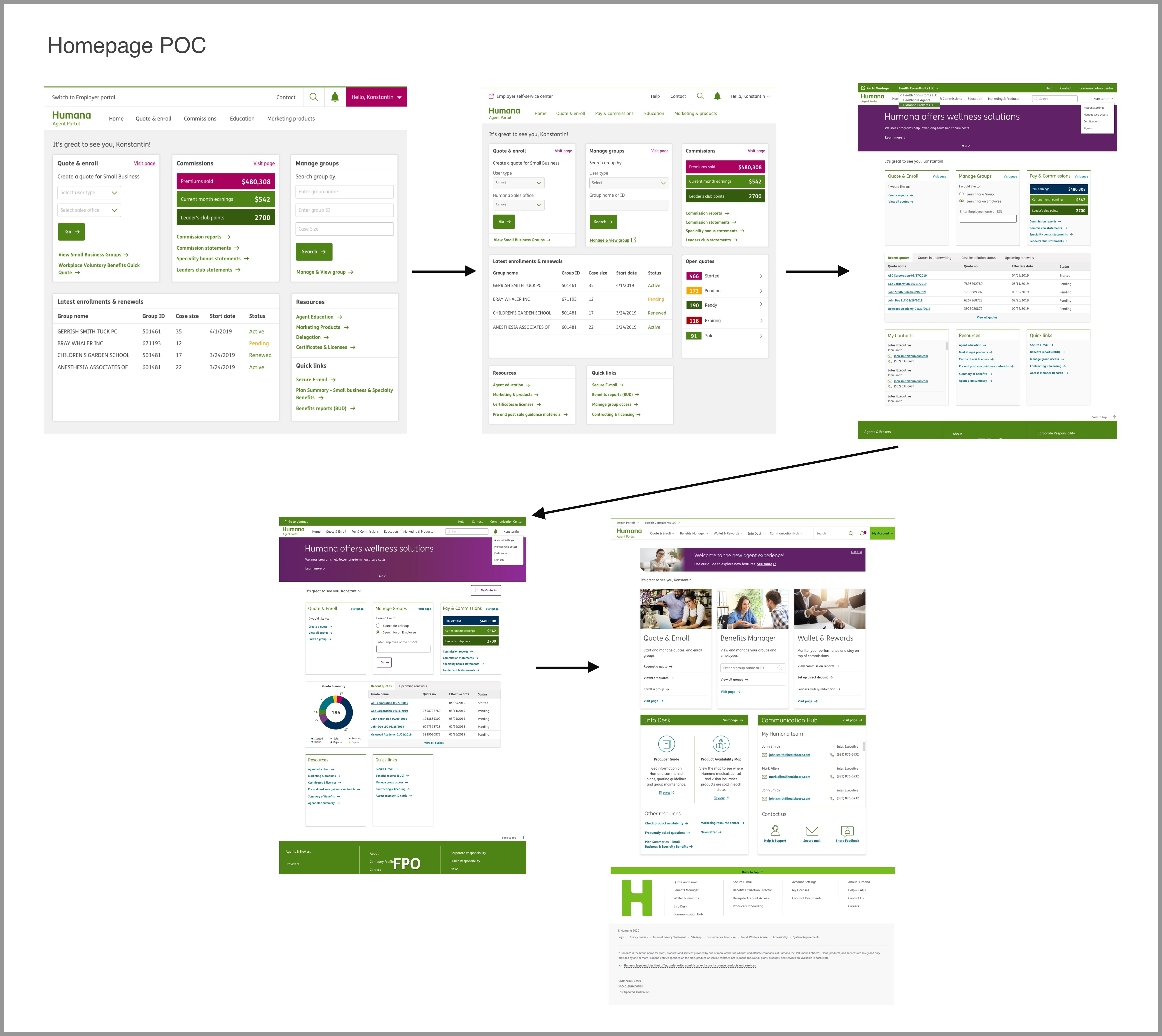
After identifying the major user tasks I created task flows and reunited with the team for approval. The next step
was to create wireframes and rough sketches of the screens to test these flows with users.
As you can see, all the major tasks — quoting, enrollment, managing customers, and payments — can be performed
using the newly designed solution. The goal was to provide access to information as fast as possible. After
continuous iterations I decided to classify and surface links to major tasks clearly on the homepage.
 Solution 2: Consistent UI with Brand Standards
 Solution 3: Improved usability with the new employer account listing page
 Solution 4: Ability to switch portals using single sign-on
The 'Switch portals' dropdown helps users navigate directly to other portals instead of returning to humana.com
and logging in to a different portal.

Measure Outcome
Through several rounds of user testing with the same 20 agents, I found 100% satisfaction amongst agents, and the
time to complete the above-listed major tasks was reduced by an average of 15 seconds (45%) with 100% efficiency
in data.